Case studies
Case studies
Six projects, described by sector rather than by name. Each one sets out the problem, what we did and what changed, in plain terms and without numbers we cannot stand behind.
We do not name clients on this site. Many of the organisations we work with prefer it that way, especially companies in regulated or confidential sectors. Instead, each case study describes the sector, the situation and the work, so you can judge whether our approach suits your own project. If you would like to talk to someone we have worked with, ask, and we will see who is happy to take a call.
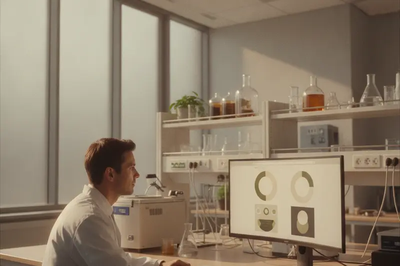
A materials spin-out at Begbroke
The situation. A young company formed around research from a university engineering group was still relying on a page on its department's website. Investors struggled to see it as a separate business, and candidates arrived at interview unsure what the company actually made. The founders had a pitch deck full of good material, but none of it was public.
What we did. We started with a two-hour session with the founders, working through the deck and two recent papers to agree a one-sentence description of the company. From that we planned six pages: home, technology, applications, team, news and careers. The technology page was written in three layers: a paragraph a generalist investor could follow, a section introducing the key ideas, and a technical section with references. Every sentence went back to the lead scientist for review. We arranged photographs of the real lab and team instead of stock images, and built the site on a simple CMS with templates for news and vacancies.
What changed. The company had a site it was comfortable sending before investor meetings and putting on job adverts, and the team could add news and roles without help. The structure leaves room for product and regulatory pages when they are needed. More on websites for spin-outs.
A physiotherapy clinic in Headington
The situation. The clinic's WordPress site was several years old. The text was pale grey on white, the price list was an image, and the embedded booking widget could not be used with a keyboard. Reception staff were spending time on calls from people who had given up booking online.
What we did. An accessibility review came first, testing the existing site with a keyboard, a screen reader and at high zoom, and listing every problem in order of harm. We then rebuilt the theme with readable type and strong contrast, turned the price list into real text, and rewrote treatment pages in plain English with the practical details patients ask about: what to wear, how long an appointment takes, whether you need a referral. The booking provider's widget was replaced with their accessible hosted page, linked from a clear button, with phone and email alternatives beside it. We published an accessibility statement based on our test results.
What changed. Patients could book without help, reception reported fewer calls from people stuck online, and the practice manager could edit pages without worrying about breaking the layout. More on accessible websites.
An educational publisher in Jericho
The situation. A small publisher maintained several hundred titles as separate, hand-built pages. Details such as editions and formats were inconsistent, some pages were badly out of date, and the site was slow.
What we did. We designed a content model in which each title is entered once, with its authors, series, subjects and formats as structured fields. Series, subject and author pages are generated from those fields, so a change in one place appears everywhere. Typography was designed for long reading, and catalogue pages were built to load fast and carry structured data. We migrated the existing titles with a script and checked them with the editorial team, setting up redirects from every old address.
What changed. Adding or correcting a title became a single short task instead of an afternoon's work across several pages, and the catalogue became consistent and quicker to browse. More on WordPress development.
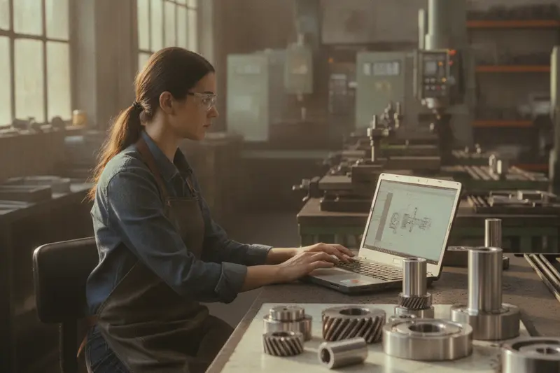
A precision engineering firm near Cowley
The situation. The firm's site was about ten years old, with one page of services, a stock photograph and a phone number. Buyers who found the firm online could not tell what it could make, and there was no way to send a drawing.
What we did. We spent a morning in the workshop with the production manager, listing machines, materials, tolerances and the sectors they serve. That became a set of capability pages, each written in the specific terms a buyer looks for, and sector pages describing typical work without naming customers. A photographer spent half a day on site. We added a recruitment section with apprenticeship information, and a quote form that accepts drawing files and asks for quantity and lead time.
What changed. Enquiries began arriving with drawings and quantities attached instead of a request to call back, and the firm had a site it was happy to point recruits to. More on website redesign.
A guest house on a main road into the city
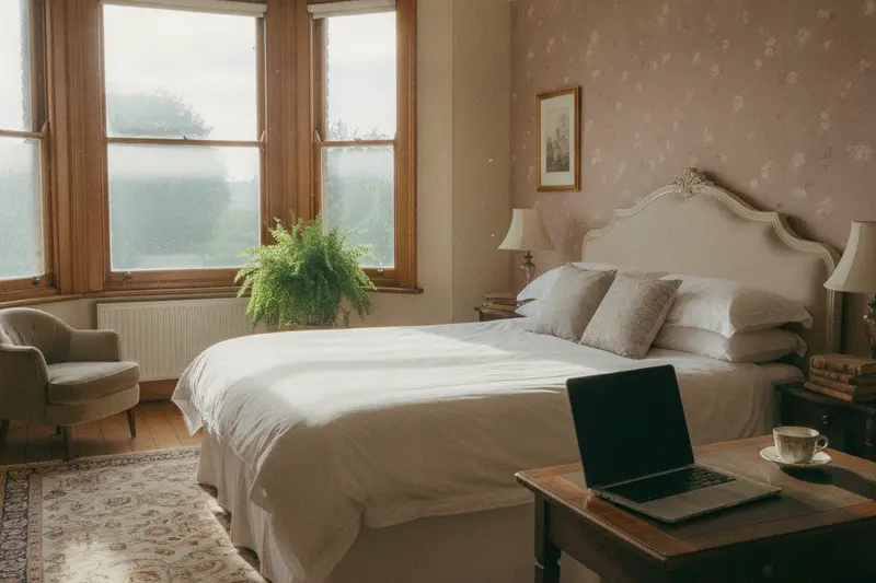
The situation. Most bookings arrived through third-party platforms that take a commission, and the guest house's own site was slow and awkward on a phone, so even guests who wanted to book direct often gave up.
What we did. We built a small, fast site around the questions guests ask: room photographs taken in good light, walking and bus directions from the railway station and the city centre, parking, breakfast times, and an honest accessibility page. Direct booking was connected to the owner's existing booking system, with availability shown on the room pages. We added notes for graduation weeks and other busy periods, published well ahead of time.
What changed. Guests had a site they could actually use to book directly, which the owners could keep up to date themselves. More on bespoke web design.
A gift and print shop near the centre
The situation. Visitors often asked whether they could order more prints after returning home, and the shop had no way to sell online. Stock was tracked on the till.
What we did. We built a Shopify store synchronised with the shop's existing till, so stock was counted once. Each print had a short story explaining the building or view it shows. We set up UK and international shipping rules based on real packaging costs, gift messages and clear dispatch times, and trained the staff to add new stock and seasonal collections.
What changed. The shop began receiving orders from past visitors outside the summer season, managed entirely by its own staff. More on e-commerce websites.
What the projects had in common
Different as they are, these projects followed the same pattern, and it is the one we would follow with you.
- Find out who reads the site. Investors, patients, buyers, guests and gift-hunters need different things.
- Write before designing. In every case the biggest improvement came from the words: specific, plain and in the right order.
- Use real photographs. Labs, workshops, rooms and shop counters, never stock imagery standing in for them.
- Make the main action easy. Book, buy, send a drawing or apply, with one clear route and a fallback.
- Leave the client in control. Each site was handed over with training and templates so the team could keep it current.